Imuno Well. Branding.
Imuno Well. Branding.

Branding
Branding
A Visual Identity Rooted in Nature and Well-being
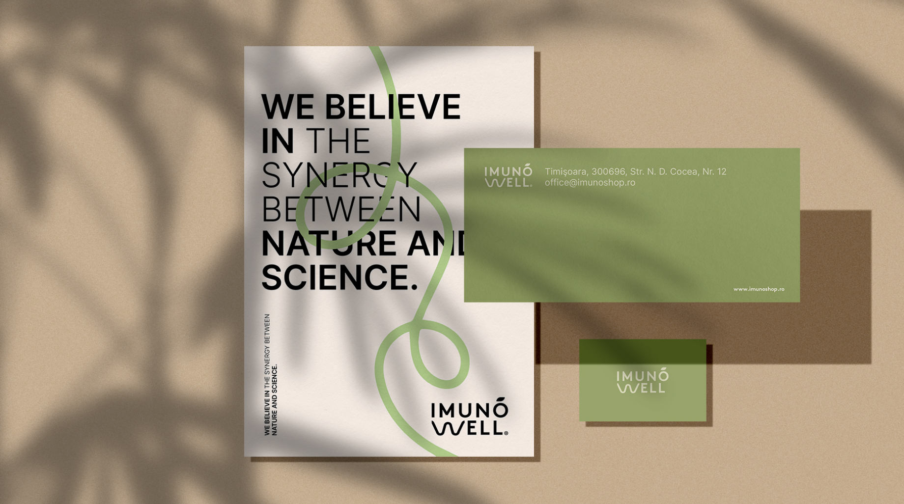
When I started working on ImunoWell’s visual identity, I knew it had to be more than just a beautiful design—it had to tell a story, one that reflects the brand’s philosophy of balance, purity, and well-being. ImunoWell is not just about products; it’s about a journey toward health, supported by nature and backed by science. My challenge was to translate this essence into a cohesive and memorable visual identity.
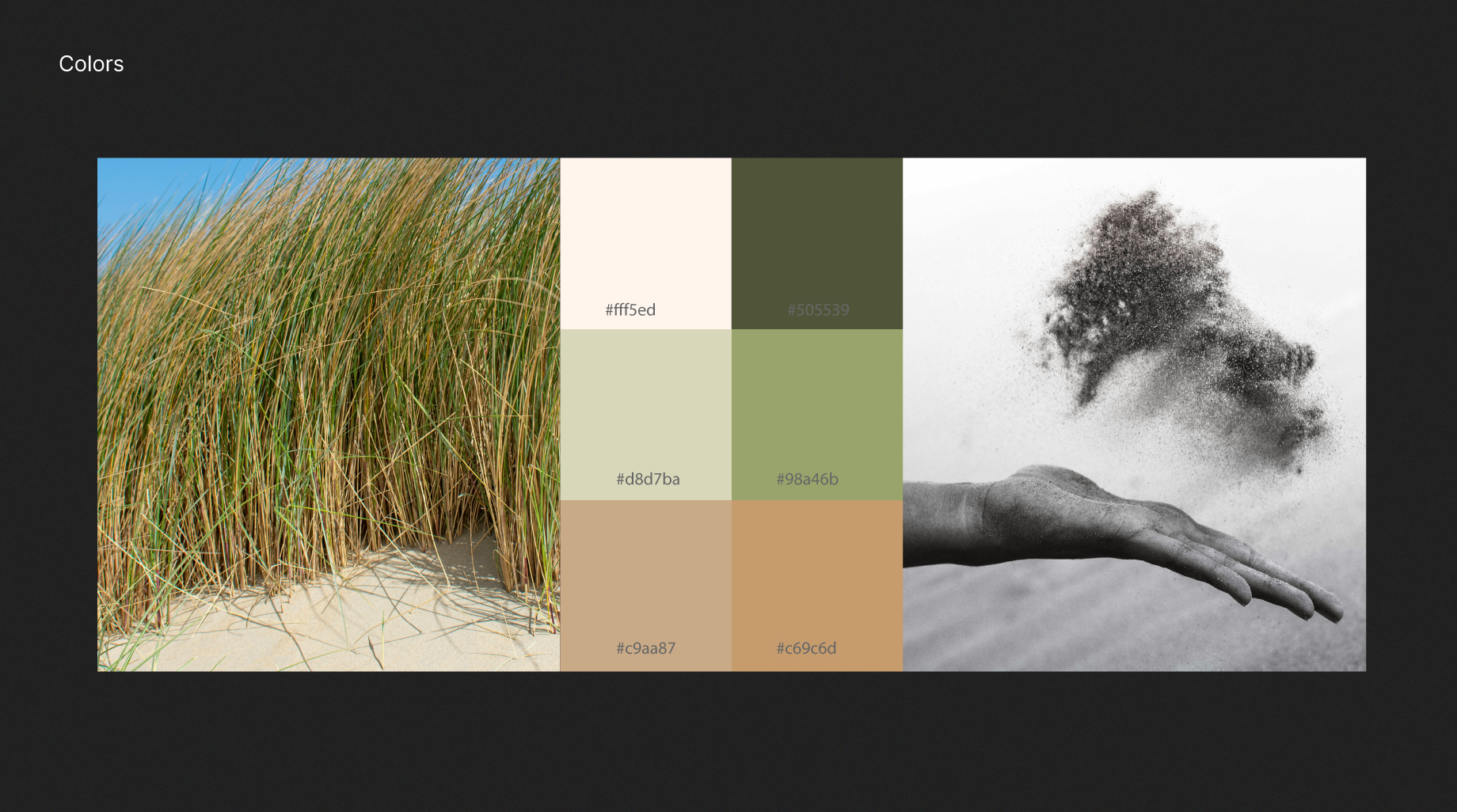
From the beginning, I focused on creating a design language that evokes clarity, tranquility, and authenticity. The goal was to develop a minimalist yet sophisticated aesthetic that feels both modern and timeless. Every design decision, from the color palette to the logo and typography, was made with the intention of reinforcing ImunoWell’s commitment to trust, innovation, and premium quality. This isn’t just about branding—it’s about creating an identity that truly resonates with the audience and distinguishes ImunoWell in a competitive market.
A Visual Identity Rooted in Nature and Well-being
When I started working on ImunoWell’s visual identity, I knew it had to be more than just a beautiful design—it had to tell a story, one that reflects the brand’s philosophy of balance, purity, and well-being. ImunoWell is not just about products; it’s about a journey toward health, supported by nature and backed by science. My challenge was to translate this essence into a cohesive and memorable visual identity.
From the beginning, I focused on creating a design language that evokes clarity, tranquility, and authenticity. The goal was to develop a minimalist yet sophisticated aesthetic that feels both modern and timeless. Every design decision, from the color palette to the logo and typography, was made with the intention of reinforcing ImunoWell’s commitment to trust, innovation, and premium quality. This isn’t just about branding—it’s about creating an identity that truly resonates with the audience and distinguishes ImunoWell in a competitive market.

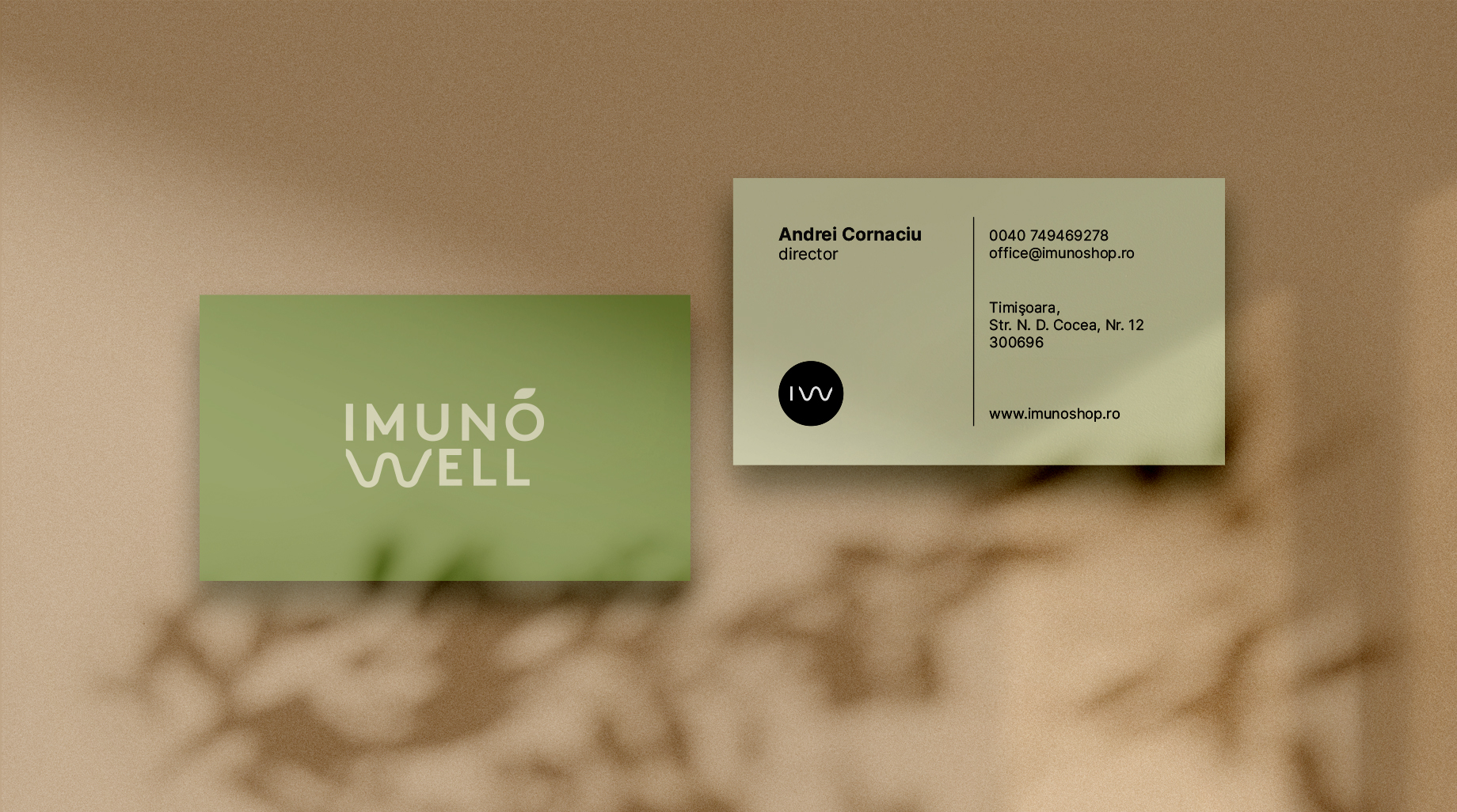
A Logo That Tells a Story
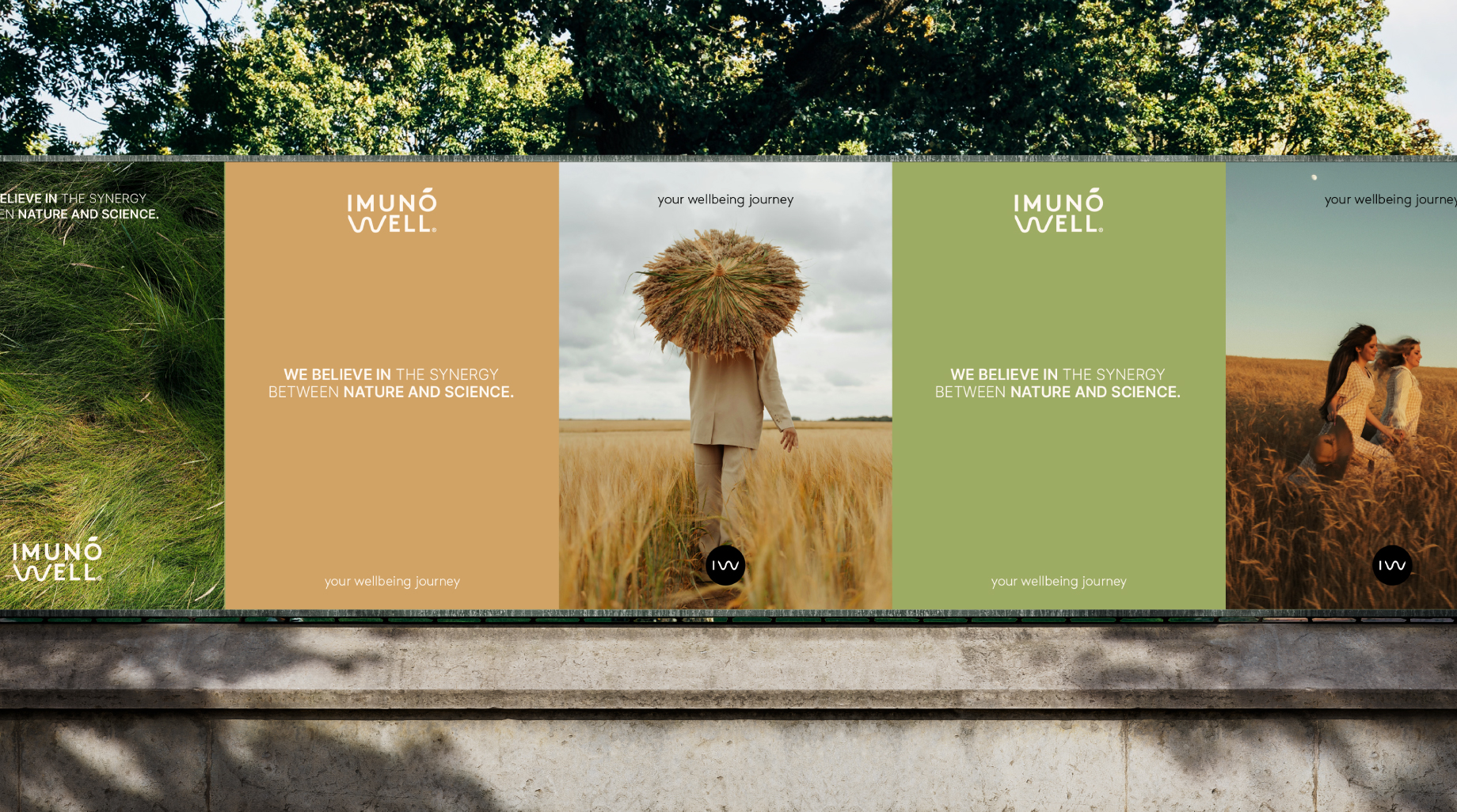
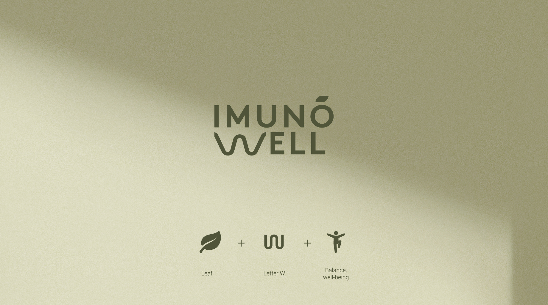
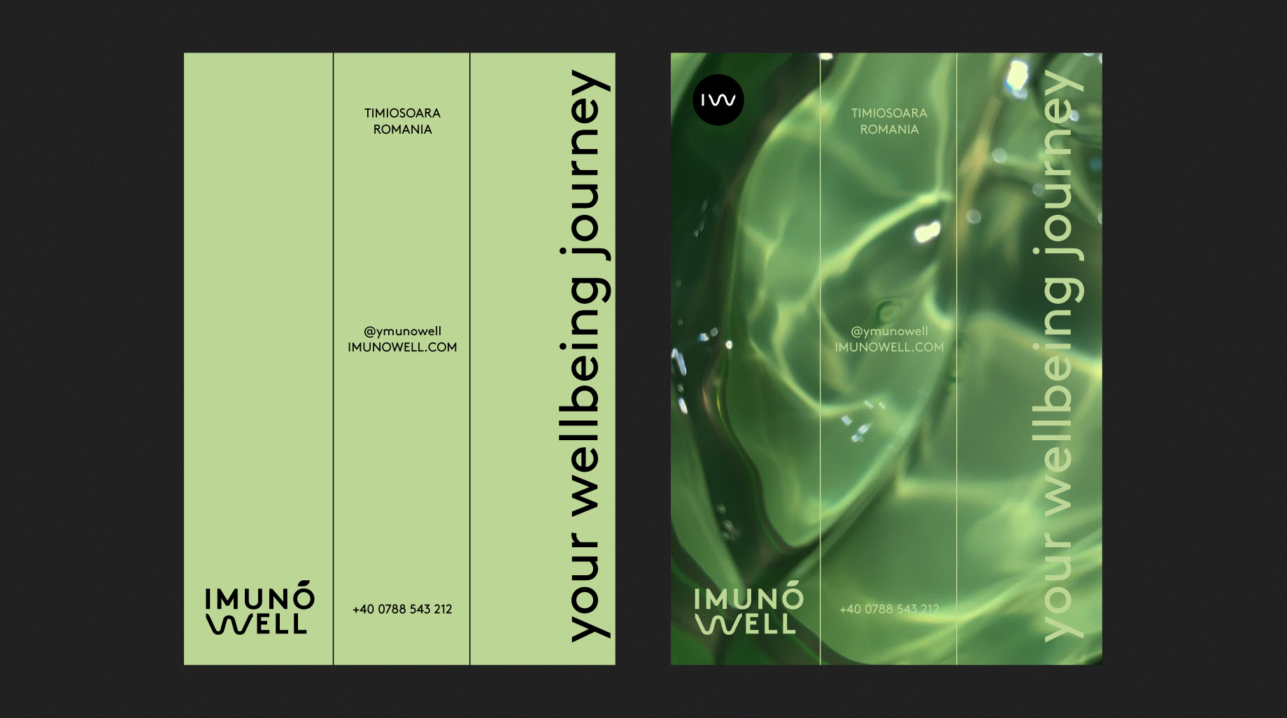
The ImunoWell logo is designed to be both elegant and meaningful, capturing the essence of the brand in a simple yet powerful way. A key feature of the logo is the transformation of the letter “O”, which is accentuated by a delicate leaf motif. This subtle yet intentional detail visually reinforces our dedication to nature, purity, and the healing properties of our ingredients.
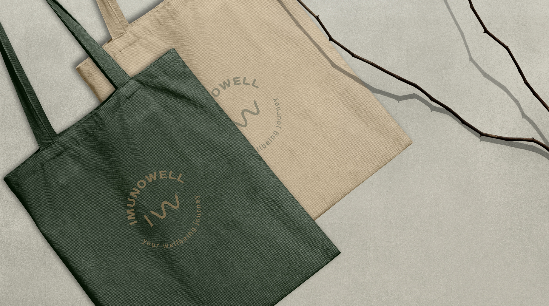
Additionally, the letter “W” has been reimagined as a modular symbol, inspired by the organic curves found in nature. This unique design element creates a sense of movement and fluidity, reflecting the dynamic balance between body and nature—a core value of ImunoWell. Through this carefully crafted symbolism, our logo becomes more than just a visual mark; it becomes a representation of harmony, transformation, and well-being.
A Logo That Tells a Story
The ImunoWell logo is designed to be both elegant and meaningful, capturing the essence of the brand in a simple yet powerful way. A key feature of the logo is the transformation of the letter “O”, which is accentuated by a delicate leaf motif. This subtle yet intentional detail visually reinforces our dedication to nature, purity, and the healing properties of our ingredients.
Additionally, the letter “W” has been reimagined as a modular symbol, inspired by the organic curves found in nature. This unique design element creates a sense of movement and fluidity, reflecting the dynamic balance between body and nature—a core value of ImunoWell. Through this carefully crafted symbolism, our logo becomes more than just a visual mark; it becomes a representation of harmony, transformation, and well-being.

Typography and Brand Aesthetic
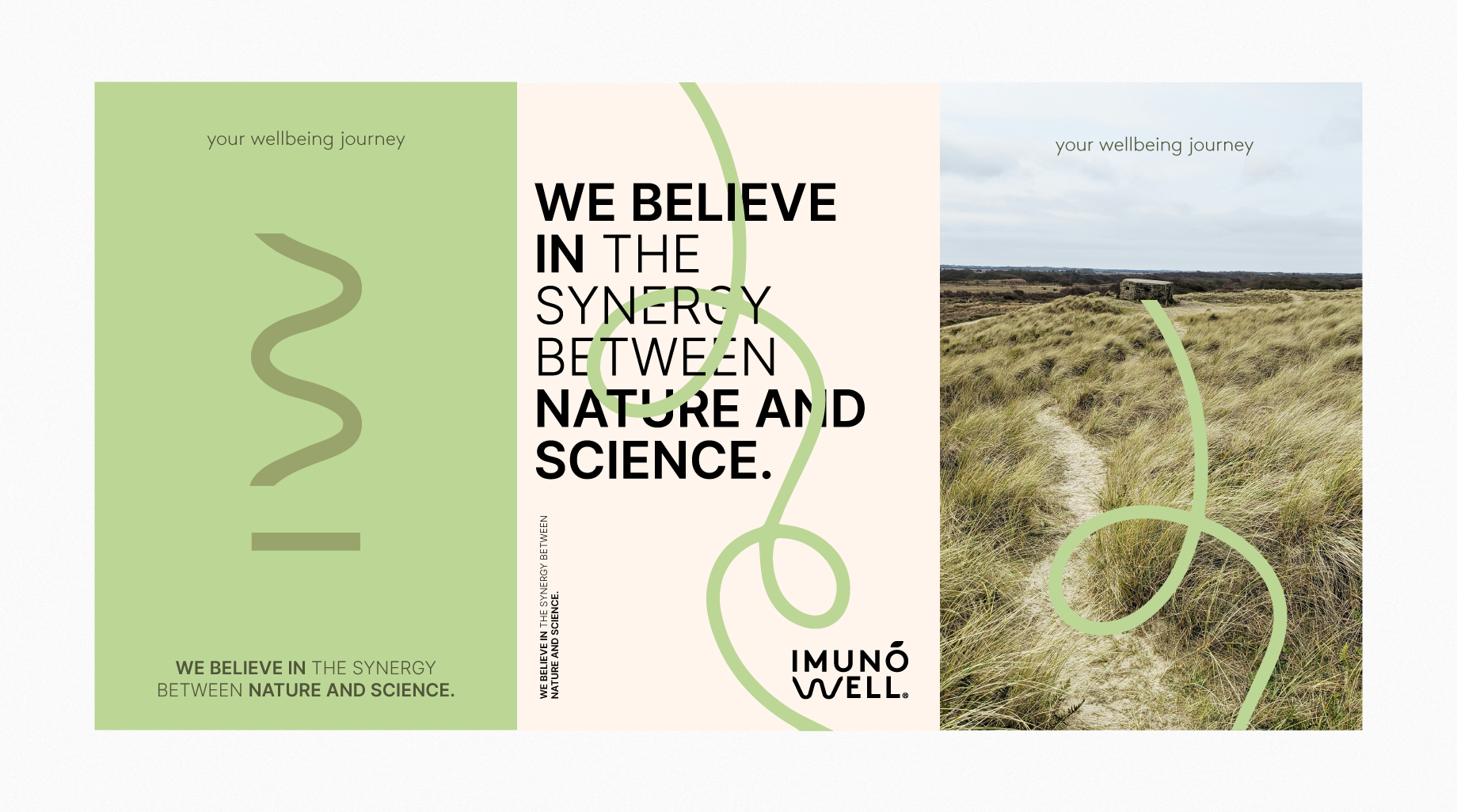
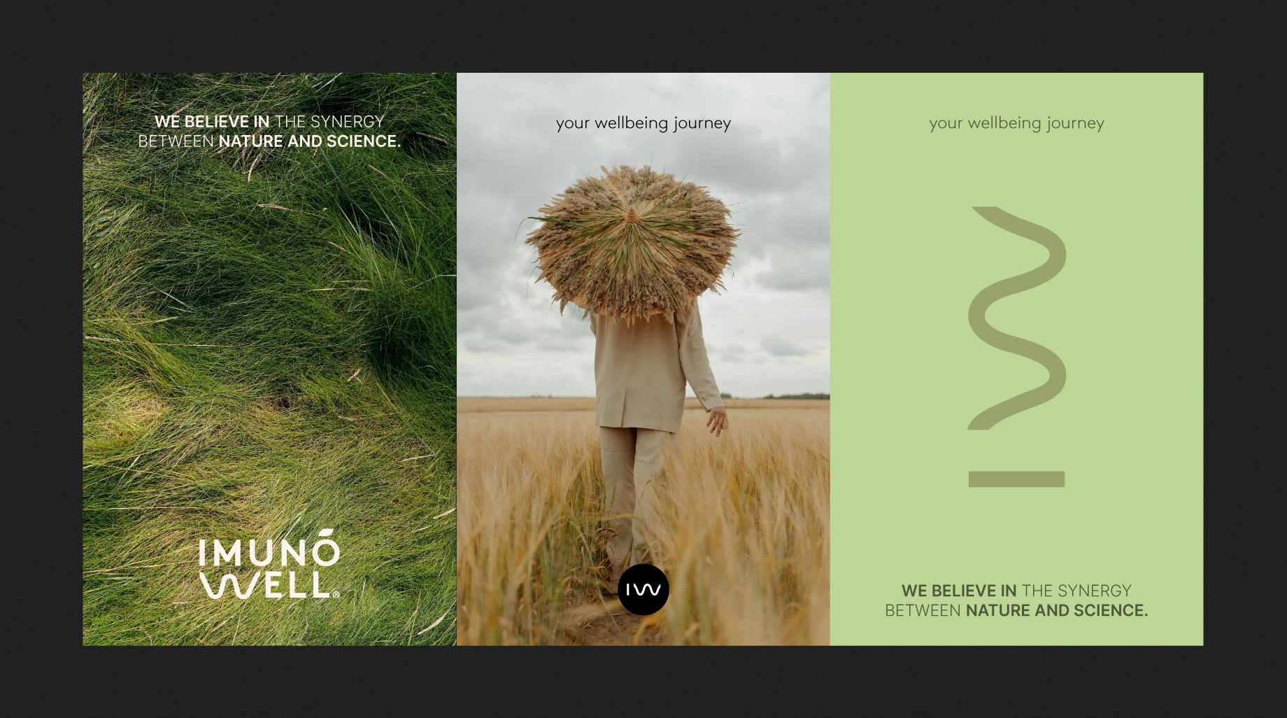
To further enhance the brand’s visual identity, the typography used in ImunoWell’s communication follows a modern, clean, and approachable style. The selected fonts balance sophistication with warmth, ensuring legibility while maintaining an inviting and premium feel. A combination of serif and sans-serif typefaces creates a contrast that mirrors the synergy between tradition and innovation—the natural wisdom of healing plants and the scientific research that validates their benefits.
Every design element, from the font choice to the spacing and alignment, contributes to a seamless and aesthetically pleasing brand experience. The result is a brand identity that feels contemporary yet timeless, refined yet accessible.
Typography and Brand Aesthetic
To further enhance the brand’s visual identity, the typography used in ImunoWell’s communication follows a modern, clean, and approachable style. The selected fonts balance sophistication with warmth, ensuring legibility while maintaining an inviting and premium feel. A combination of serif and sans-serif typefaces creates a contrast that mirrors the synergy between tradition and innovation—the natural wisdom of healing plants and the scientific research that validates their benefits.
Every design element, from the font choice to the spacing and alignment, contributes to a seamless and aesthetically pleasing brand experience. The result is a brand identity that feels contemporary yet timeless, refined yet accessible.