Girafffe. Branding.
Girafffe. Branding.
Branding
Branding
When an open-minded customer is at the core of a business, the final brand is a creative one that goes beyond the rules of a rigid field such as security.
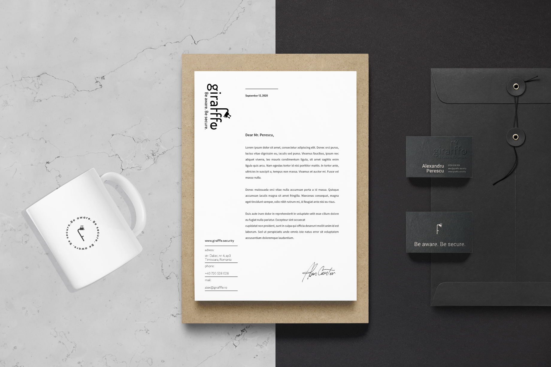
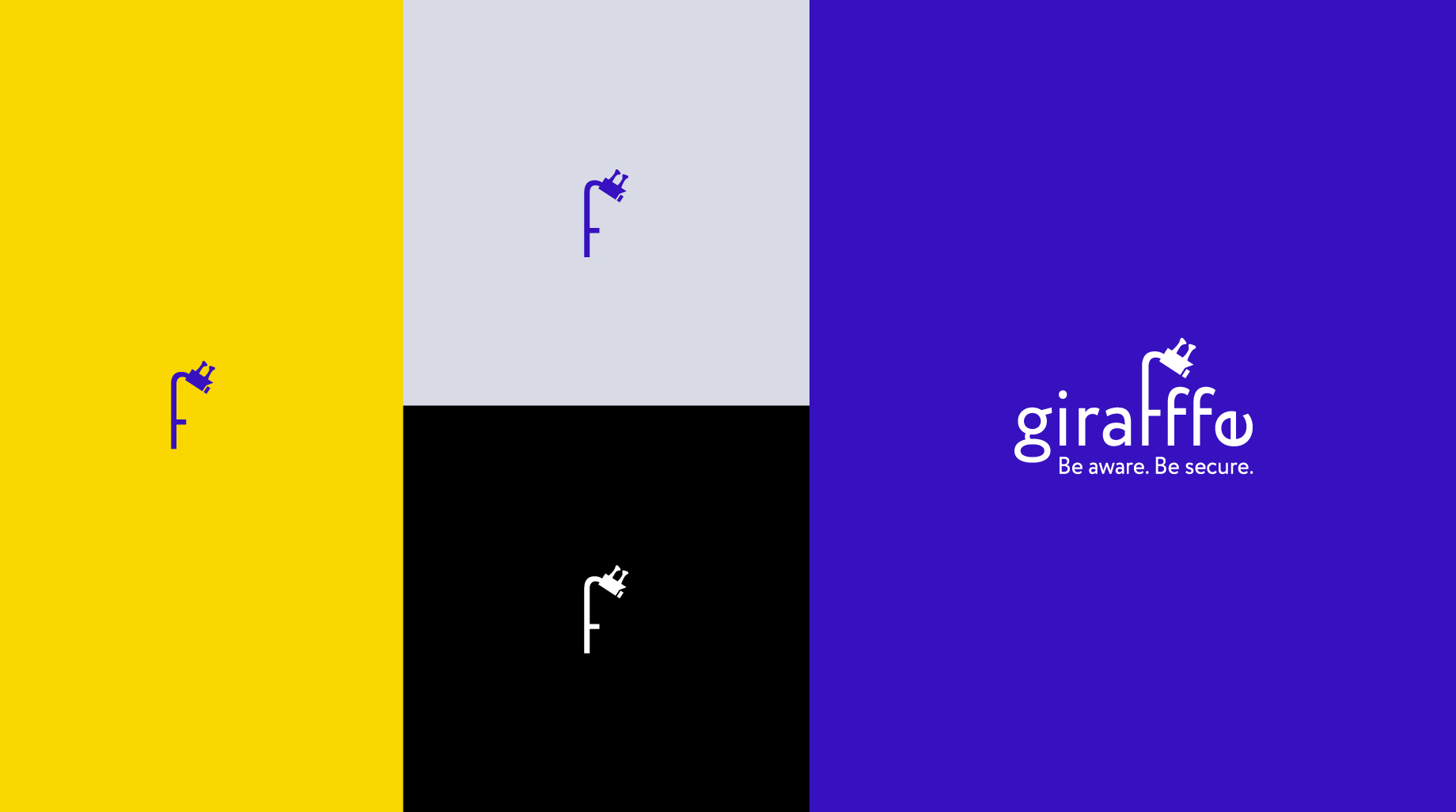
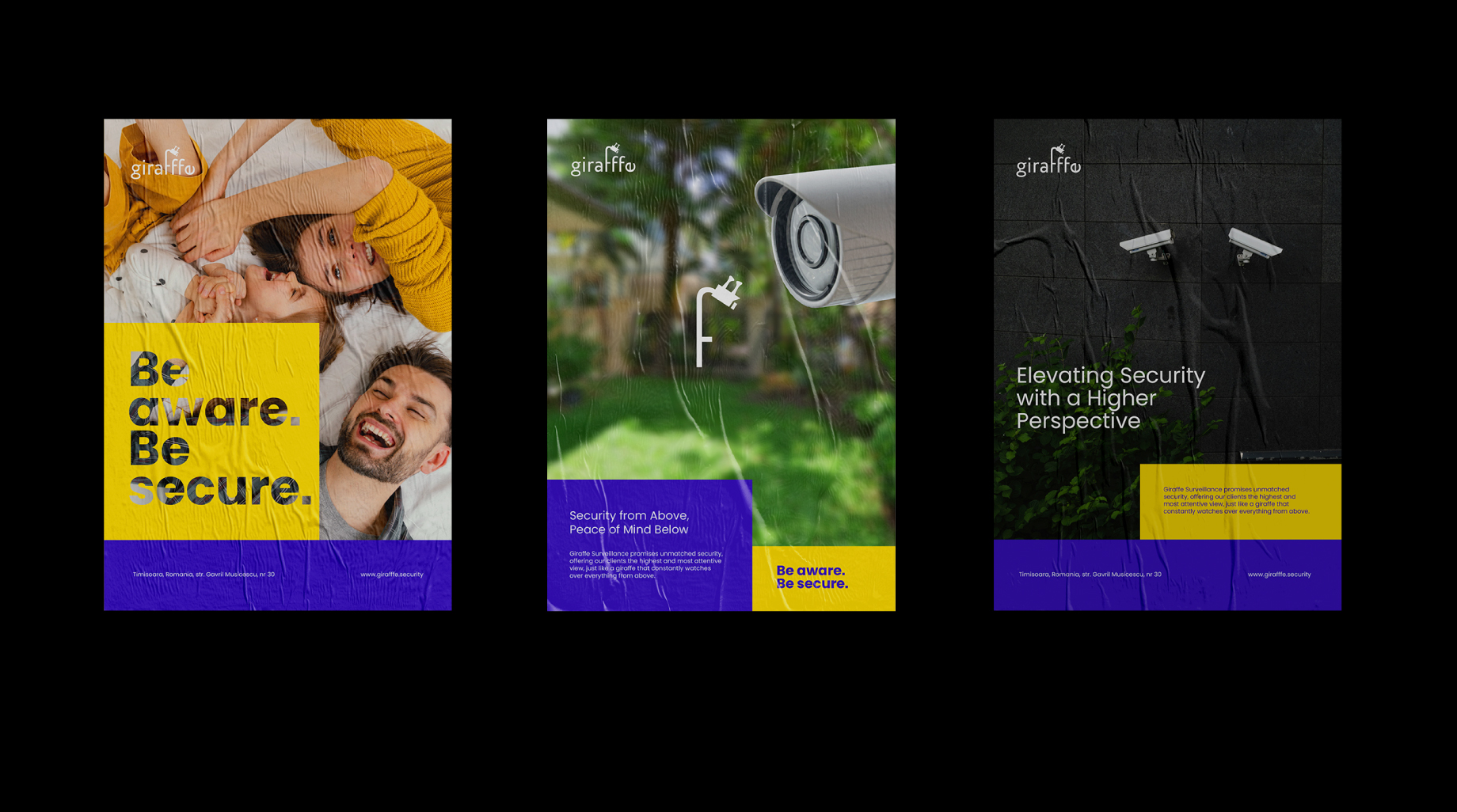
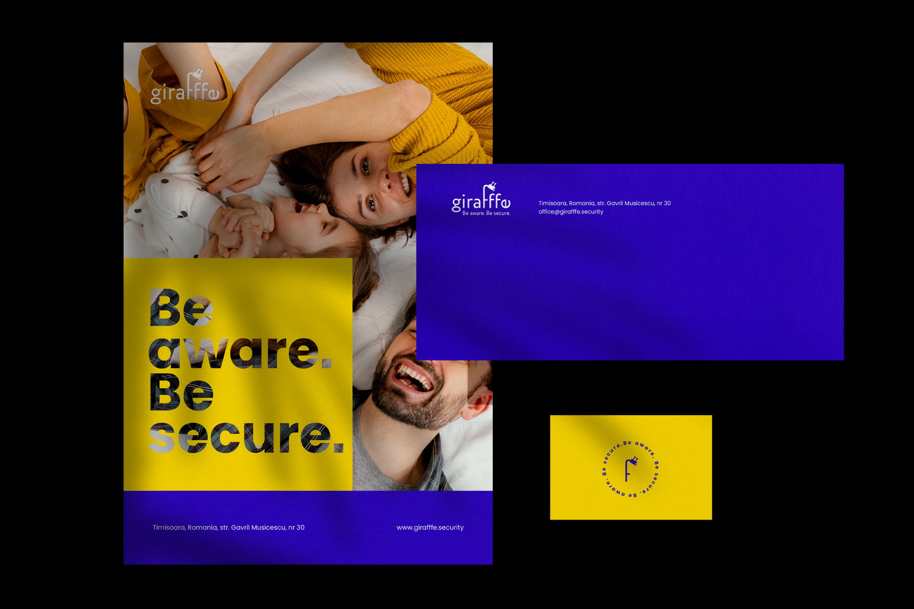
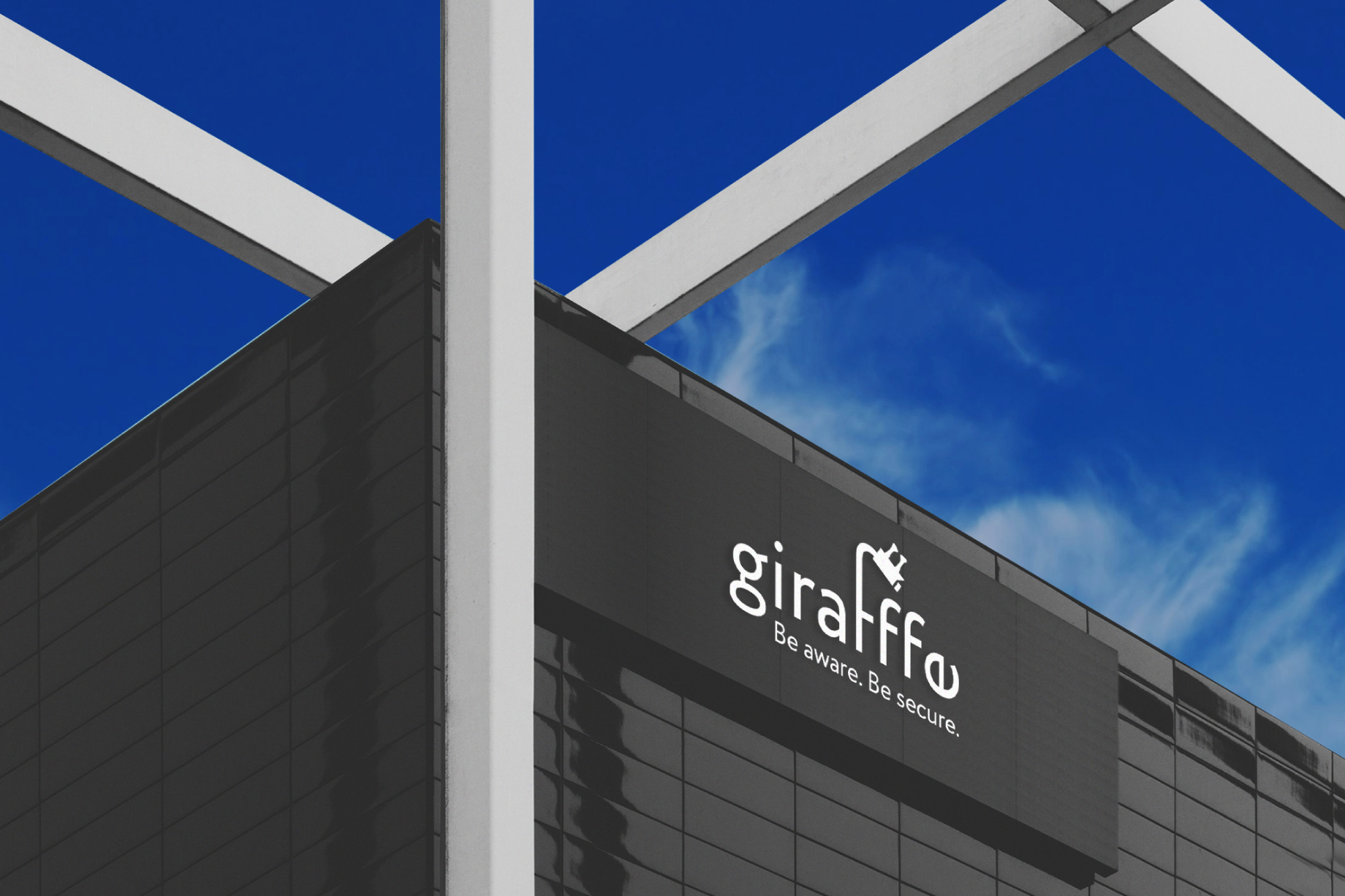
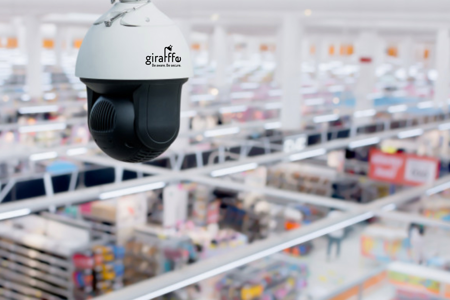
The logo created conveys the idea of safety / surveillance by lengthening the letter “f” which ends with a surveillance camera, making the connection with the security field.
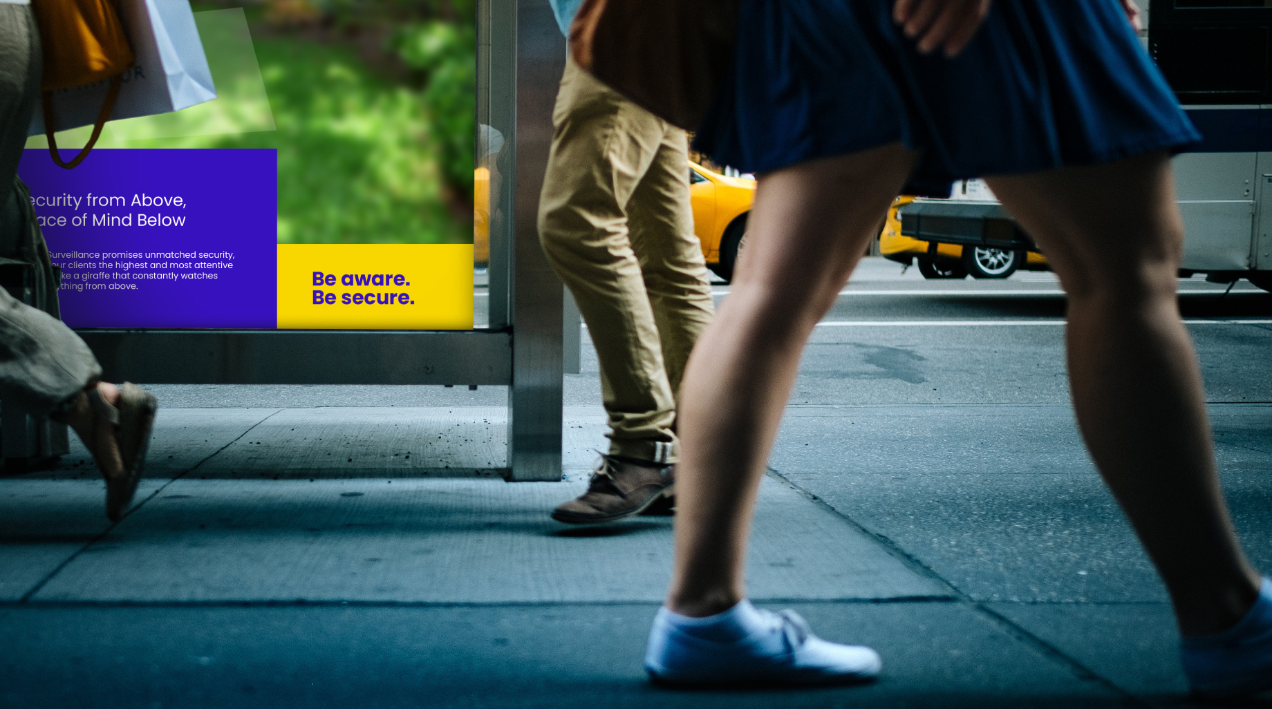
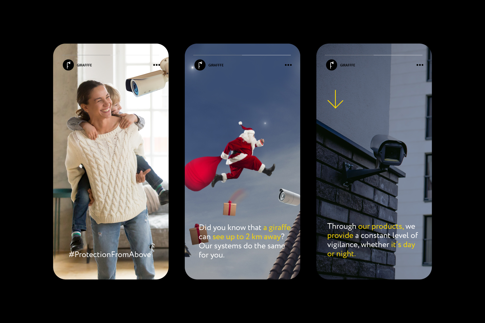
Each graphic element has been carefully chosen to convey a message that emphasizes the main activity of the client.
When an open-minded customer is at the core of a business, the final brand is a creative one that goes beyond the rules of a rigid field such as security.
The logo created conveys the idea of safety / surveillance by lengthening the letter “f” which ends with a surveillance camera, making the connection with the security field.
Each graphic element has been carefully chosen to convey a message that emphasizes the main activity of the client.
When I began creating the logo for Giraffe Surveillance, I wanted to capture more than just a visual symbol. I aimed to convey a clear and powerful idea: safety from above. The giraffe, with its long neck and panoramic view, became the perfect source of inspiration.
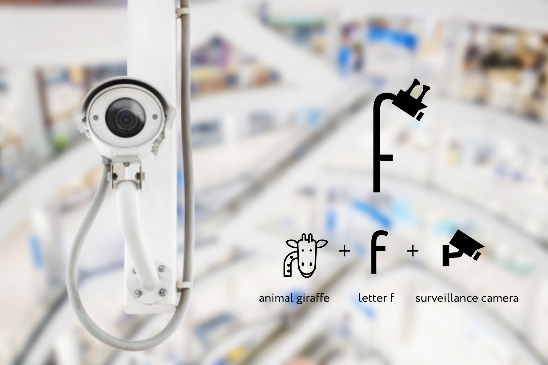
The first element that came to mind was the letter “f” – tall, slender, and full of potential for transformation. I deliberately elongated it to suggest the elegant neck of a giraffe, and at the top, I subtly integrated a surveillance camera – the direct connection to the brand’s field of activity. I wanted this detail to be more than decorative; it became the central story of the logo.
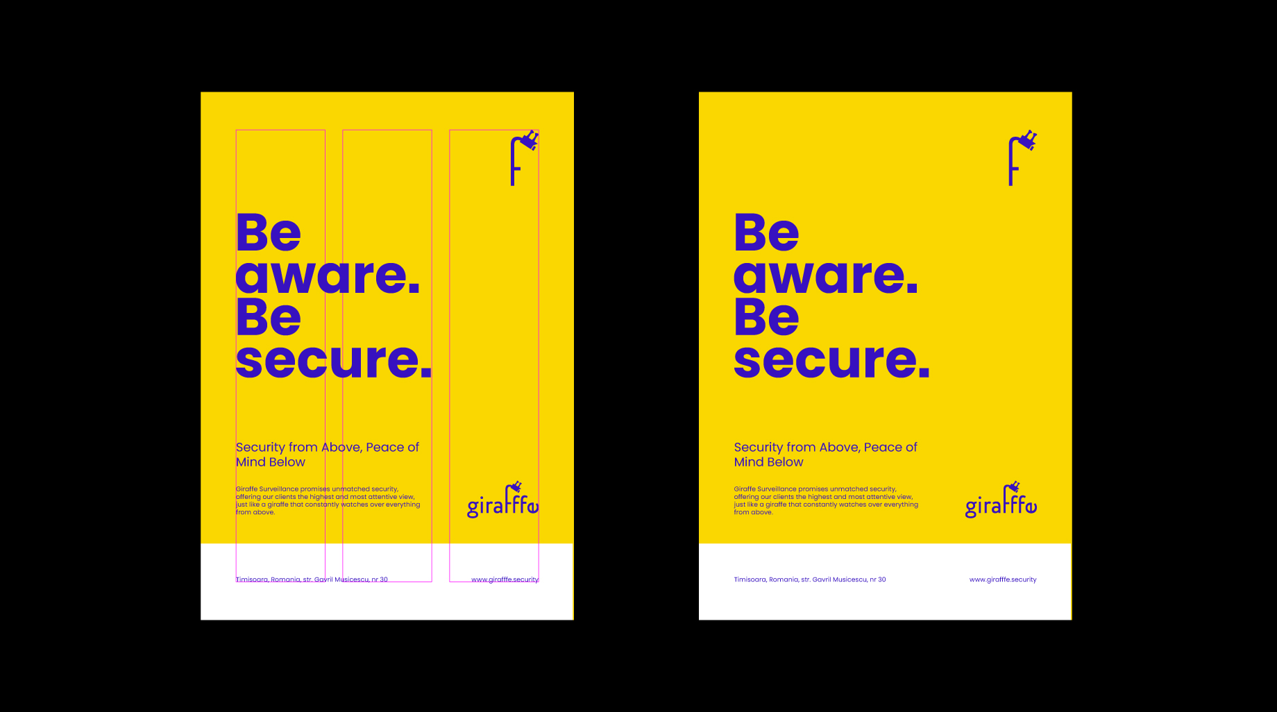
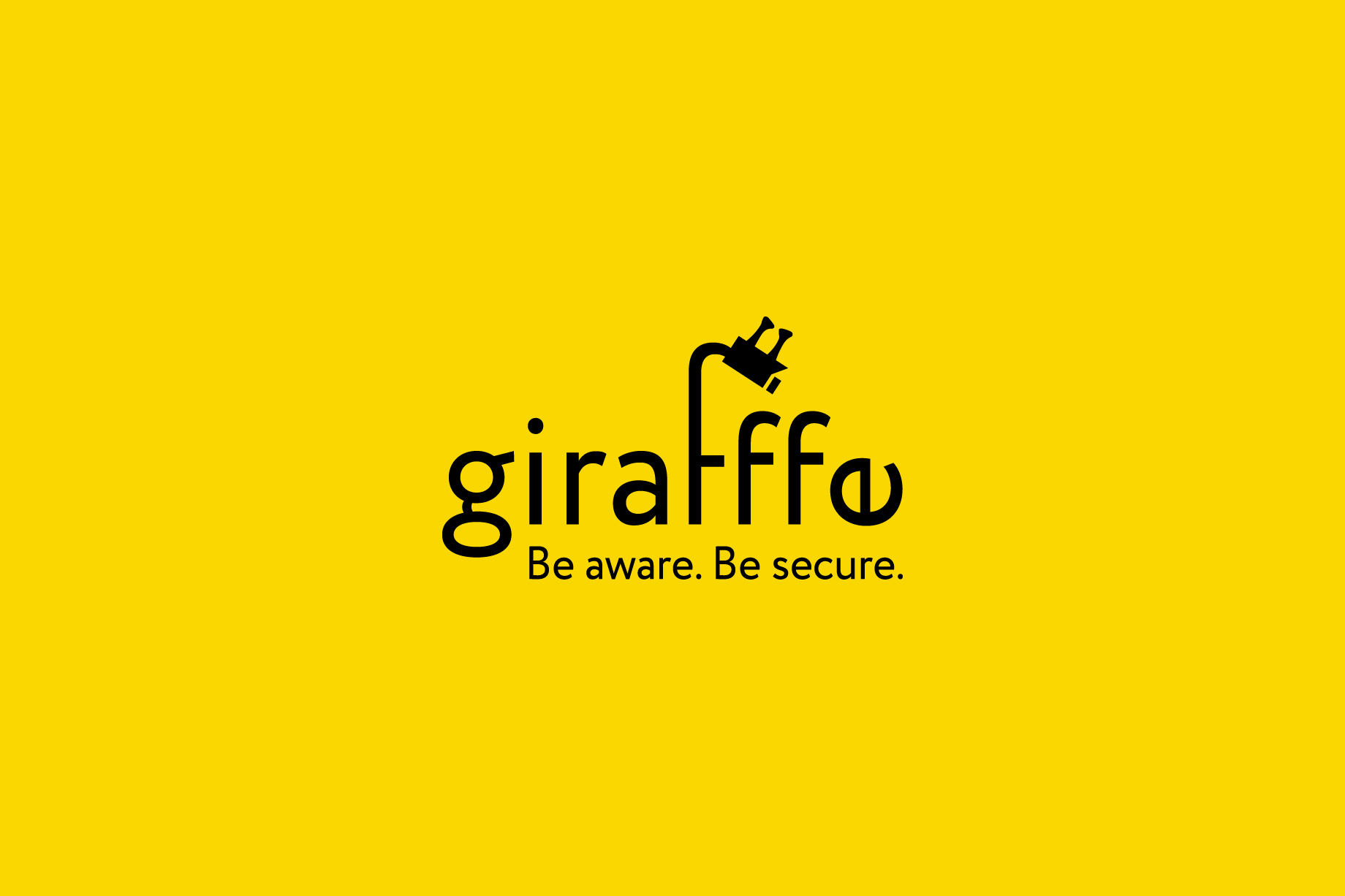
I chose simple, fluid shapes to convey trust and professionalism, while maintaining a friendly tone. The colors were carefully selected: a warm yellow, reminiscent of a giraffe’s natural hues, combined with blue, symbolizing technology and security. Together, these colors create the perfect balance between the approachable nature of the brand and its promise of top-tier protection.
When I began creating the logo for Giraffe Surveillance, I wanted to capture more than just a visual symbol. I aimed to convey a clear and powerful idea: safety from above. The giraffe, with its long neck and panoramic view, became the perfect source of inspiration.
The first element that came to mind was the letter “f” – tall, slender, and full of potential for transformation. I deliberately elongated it to suggest the elegant neck of a giraffe, and at the top, I subtly integrated a surveillance camera – the direct connection to the brand’s field of activity. I wanted this detail to be more than decorative; it became the central story of the logo.
I chose simple, fluid shapes to convey trust and professionalism, while maintaining a friendly tone. The colors were carefully selected: a warm yellow, reminiscent of a giraffe’s natural hues, combined with blue, symbolizing technology and security. Together, these colors create the perfect balance between the approachable nature of the brand and its promise of top-tier protection.